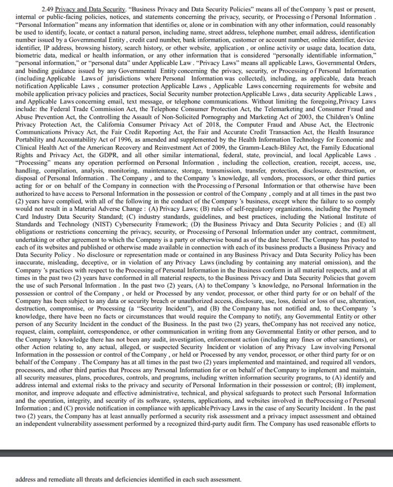
Most of us know we’ll lose readers with a single big block of undifferentiated text: one of the many reasons legalese is so hard to sift through. Fewer of us know that we’re just as likely to lose readers with rapid-fire single sentences featuring repeated double line breaks and strategic emoji: think those obnoxious marketing posts in your social media, wanting you to buy the system that will finally work.
Since that’s getting a little into the editor-speak weeds, here’s a visual:


To some degree, these problems have the same root cause. When we learn to read, our cultural dictates shape the muscle movements and thinking processes that help us internalize the meaning conveyed in a collection of marks on a surface. Those processes cluster into sets of rules we label genres: our expectations for reading a legal contract are very different from our expectations reading a social media ad, for example. The important rule for both of these–especially if we’re trying to encourage readers to stick around long enough to interact with our product offerings–is line length.
Defined most simply as the measurable distance from the left side of a wall of text to the right side of a wall of text, line length describes the amount of movement our eyeballs require to process the text itself. In environments that require us to consider how this might differ from mobile to laptop environments, line length can get awful tricky.
Our eyes function much like a typewriter carriage (I know that’s an outdated referent, but go watch the opening of Murder She Wrote if you need a baseline). When the carriage reaches the preset indicator for the edge of a page, it springs back to the left to start over. We also need that hard line to reset, to tell our eyes that it’s time to move back to the beginning and continue on the next line.
Remember that awkward experience in high school English when you had to read a poem out loud and couldn’t stop blushing? Part of that struggle is that poetry usually intentionally disrupts our line length expectations to help us pause and reflect on the content of each line; in our business writing, we need to bring similar intentionality to our choices about where to break our lines. Since our readers are gifting us their time without the outside pressure of a teacher holding their grades hostage, it’s even more vital for us to consider their needs.
Too many short lines that look, essentially, the same: our eyes get tired. Too many long lines with small punctuation marks and no big white-space pauses like indentations: our eyes get tired. Most online spaces are going to benefit most from short, concise paragraphs that feel bite-size on a big screen and snackish on a small one.
